iSpot.tv
Homepage re-envisioned
Why was this project started?
Role: UX & UI designer, art lead
Client: iSpot.tv
Software: Axure, Illustrator, Photoshop
When I started at iSpot.tv in March of 2018, they had just completed the redesign of their primary product- the iSpot Analytics Dashboard. Not long after this project was shipped, the newly formed marketing department set to work on re-envisioning iSpot’s place in the market. This new positioning included a new tagline, and a major need for an overhaul of the original iSpot homepage.
Major areas of focus for the revamp:
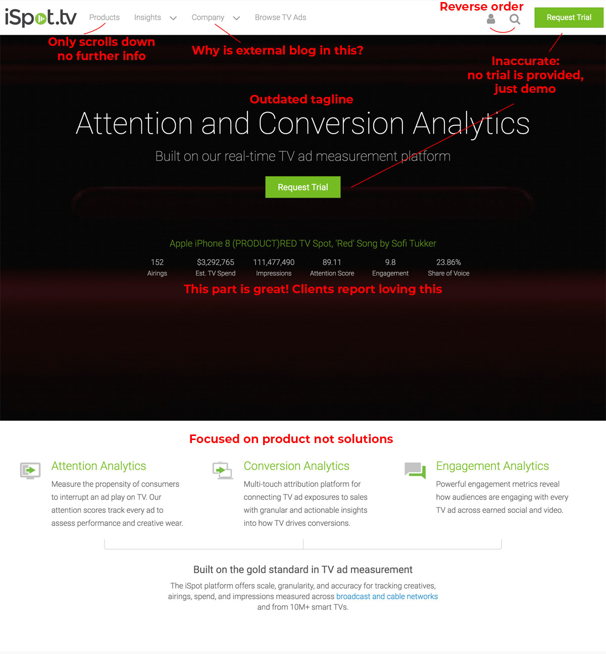
Messaging: Shifting the focus to outcomes rather than features. The original site was quick to describe all the wonderful features available on the platform, but not how they helped you, as a customer, make better decisions for your advertising strategy.
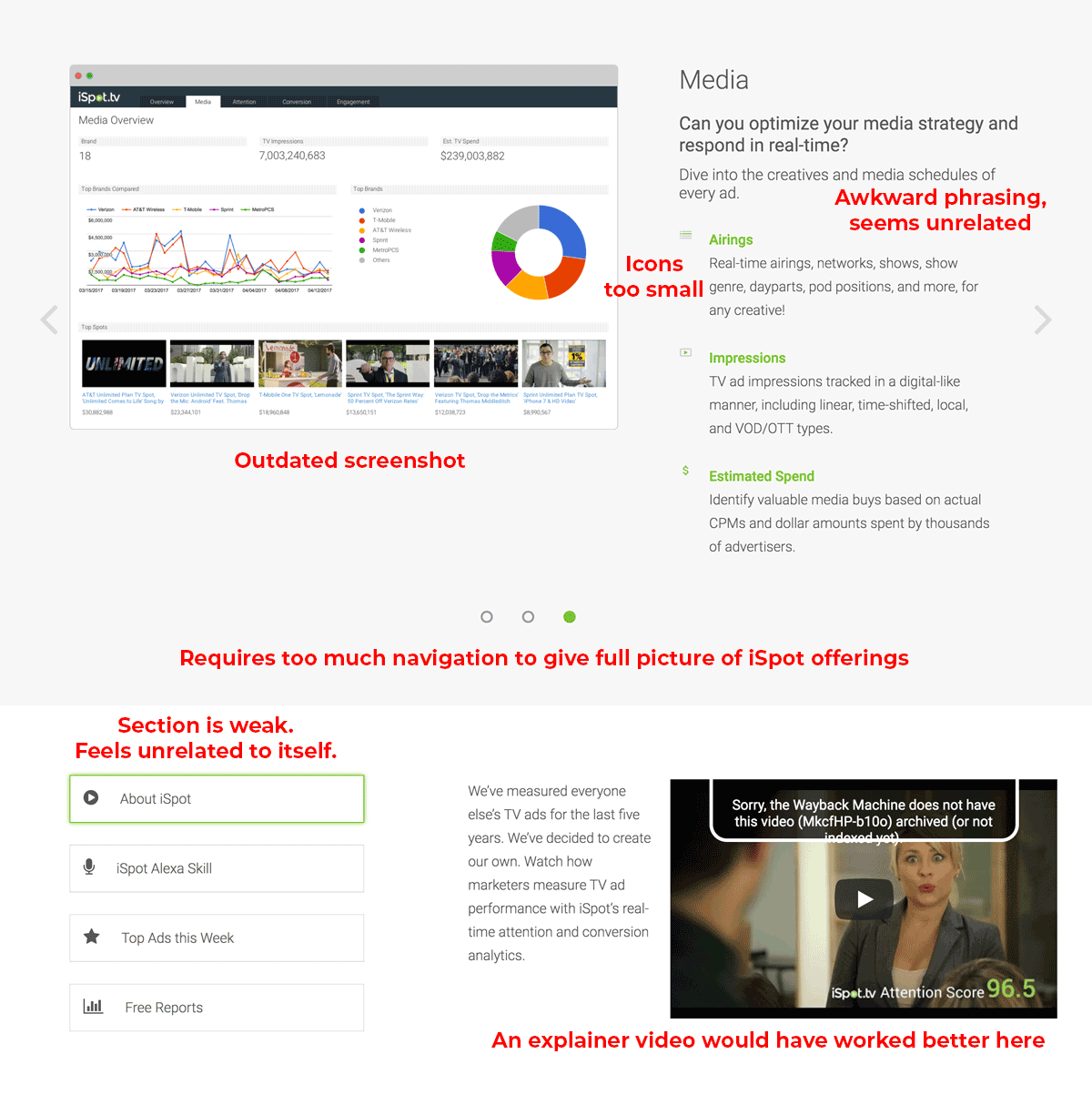
Visuals: The graphics, fonts, and flow were outdated. The original dashboard was still featured in many places, and in others, the new screen view had been haphazardly thrown in to replace it. Shifting to graphics that more readily explained what a screenshot represented would improve engagement and understanding, and hopefully, conversions.
Architecture: The shifting focus is most clear in the architecture. Original navigation included: Products, Insights, Company, Browse TV Ads. The new architecture shifted from Product to Solutions, and the Blog/Events section has been moved out from under the Company heading into its own section as the events and blog were external focused, and the newly named “About Us” was internally focused- featuring careers and customer list. Insights and Browse TV Ads remained untouched in the architecture.
How did you approach research?
I started by conducting an analysis of our current homepage. What worked, what wasn’t, how long did people spend on the pages, and where did they drop off. Once that was done, I moved on to thorough competitor research.
Direct competitors: Full analysis & architecture mapping, including pattern analysis and positioning.
Analytics companies: Analyzed sites for site maps, messaging, and graphics.
Analyzing design patterns: Best practices for the key elements and design samples were collected & analyzed across many sites.
How did this research affect what was prioritized?
Through comprehensive analysis, it became clear we needed a greatly simplified approach to our architecture. Competitors hid much of their information under several layers that took significant digging to find- and were often difficult to find again on second glance. With a bounce rate of less than 2min on our primary site, we needed the information to be clear and concise.
Because of this, the primary focus of the redesign shifted to include the homepage and solutions pages, with the additional pages being considered secondary to the conversion goal.
Early design: Where did you start?
At the beginning of the project, I was handed a simplified site architecture overview by the marketing and business development team. After completing the analysis of competitors’ sites, I proposed edits to this draft based on what the most effective architecture, and proposed specific breakdown of page purpose, what should be included on each page, and the importance of each item type. Once the elements were agreed upon, I set about whiteboarding potential page layouts.
From there, it was on to the whiteboard to design the page flow.
How did the design evolve?
Like most designs, I started with a wish list to be whittled into MVP. Video snippets became graphics and screenshots with the potential to add a lightbox function for future video implementation.
Originally, only a small amount of text was planned for the homepage design. After the site was fully developed, the amount of text was expanded significantly.
Some original design elements were deemed too resource-heavy to reproduce. Minor alterations were made to accommodate development.
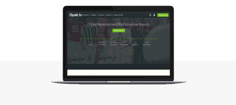
Final design
With a clear eye path, visitors can find anything they’re looking for quickly- and enjoy a good story along the way.
Focused on the visual impact to ensure that even at first glance you knew what iSpot was all about.
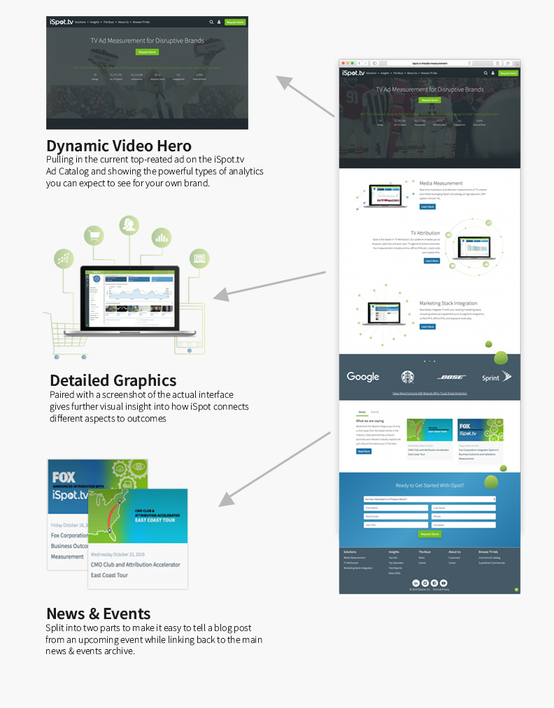
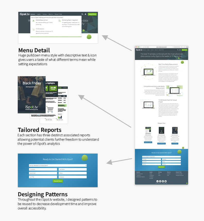
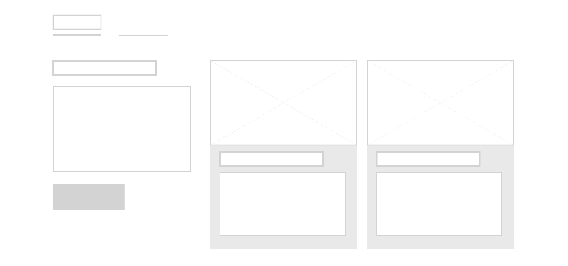
Sub-pages and patterns
It was important that I design patterns for use among the many breakdown pages. These included the hero styling, page flow, contact form, reports carousel, and others.
Menu detail
Not every potential customer has a grasp of the lingo commonly used in TV advertising analytics. By providing context, the potential customer is able to find what they’re looking for faster, without the needless guesswork.
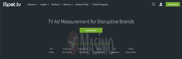
Old:

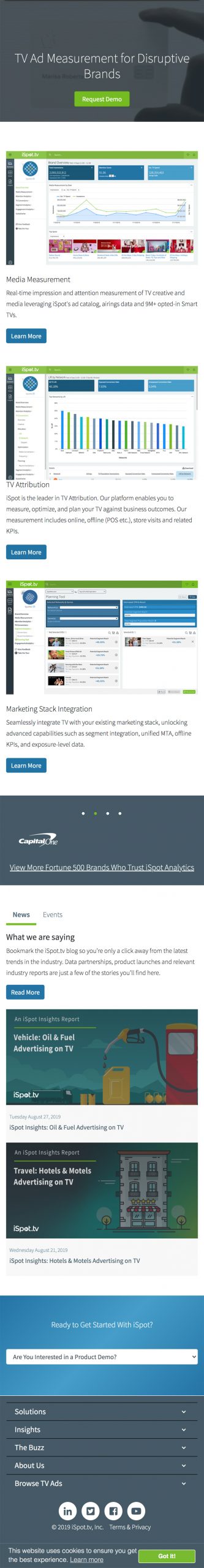
New:
Mobile view comparison
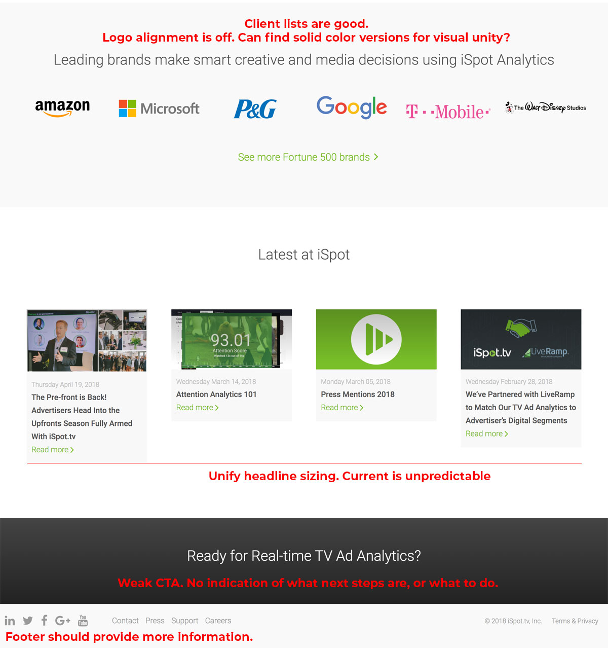
The mobile view is another area that has benefitted from the redesign. As you can see, the overall length of the original site was quite long, and the call to action gave no clear indication of next steps. It was text-heavy and required significant navigation to find all the information on the product offering.
The new design focuses and clearly outlines the solutions while minimizing the number of extras on the page. The call to action (CTA) is arrived at earlier and stands out against the rest of the page to draw attention.
Old mobile view

New mobile view
Post design analysis
Impact:
From a marketing and sales point of view, the redesign provided clear delineation of the actual offerings, which was easy to navigate based on their use case. The sales team sent thanks and praise, saying this made this job much easier as it provided the content in a way that pleased both high-level customer (CMO) and their staff data scientists.
What was successful about this project? What wasn’t?
The new design was a fun and useful update from the original site. Due to time constraints on development, all areas that were due for a redesign were not completed, and early on the focus was shifted to the main areas of the site rather than an overhaul of the About Us, Events/Blog, and Browse TV Ads sections.
Recommendations for designers about to undergo redesigns
Have an understanding of the current KPIs prior to starting the redesign process, including the current bounce rate and time spent. Knowing what was really going on with the own site improves how quickly you are able to pivot the design to improve outcomes.
Using technologies such as Google Analytics and HotJar, create a clear snapshot of where potential customers are bouncing(exiting the site), and if they ever made it as far as the CTA. Without a strong foundation, it’s difficult to judge true ROI.